

Portfolio Menu
Hi, I’m
DanielCamomile
Human-Centered, Results-Driven Designer
Design is more than just visual appeal—it’s about connection and communication. I work closely with my clients, taking the time to understand their vision, challenges, and audience. By empathizing with both the brand and its customers, I craft designs that not only look great but also drive engagement, conversions, and revenue growth. Whether it’s a website, ad, logo, or book cover, my goal is to create meaningful, memorable experiences that truly resonate. For me, design is never just another project—it’s a chance to bring your vision to life in a way that connects and converts.


My design toolkit is diverse, but unified by a commitment to clean brand messaging.
Web Design
Custom WordPress
WooCommerce
Website Hostinig
UI/UX
SEO
SEMrush Certified
Google Search Console
Google Analytics
SEO Copy Writing
Graphic Design
Logo Design
Infographics
Graphic Mockups
Editorial Design
Print Design
Book Covers
Clothing + Merch
Banners + Signs
Flyers + Posters


Business Website Process
Personality Website Process
Non-Profit Website Process
Member Website Process
My Website Design Process
See an in-depth look at my website design process—the problems I face, how I solve them, and why I chose the approaches I do. Below you will find a few case studies of some of my past clients, broken up into Business, Personality, Non-Profit, and Membership categories.

Business Website Design – CloudTop Office

#1: What Was the Problem?
Cloudtop Office provides a niche service as a Virtual Host for Finance Applications. Their old site was dated and not getting the responses they wanted, so I was called in to rebuild the website, keeping most of the same content. The challenge was balancing communication between two distinct audiences:
- Primary Audience – Businesses already familiar with virtual hosting and comparing providers.
- Secondary Audience – Businesses aware of their needs but unfamiliar with the solutions available.
Striking the right balance was critical. Over-explaining could alienate informed visitors, while assuming too much knowledge could confuse newcomers. Additionally, the client was insistent on maintaining their own wording and navigation structure, which added complexity to the design process.
#2 How I Solved It
The solution was to create a homepage that instantly reassures visitors, regardless of their familiarity with the service. My approach included:
- Clean, Minimalist Design – A two-tone interface with minimal distractions to convey simplicity and build trust.
- Human-Centered Visuals – Instead of the overly technical and cluttered designs seen in competitors’ websites, I incorporated imagery of a confident businesswoman using multiple devices. This emphasized accessibility and ease of use.
- Clear Call-to-Action – A single, prominent CTA (“Get a Personalized Quote”) above the fold, encouraging direct engagement with the sales team. This approach prevented information overload while ensuring visitors could quickly find answers beyond the rigid sales copy.
Subtle Visual Cues – Deliberate design choices that subconsciously reassured users that the complex, technical aspects of financial application hosting were in capable hands.

#3 Why This Approach?
I intentionally differentiated Cloudtop Office from its competitors by prioritizing simplicity, trust, and human connection. Competitor sites often felt overly technical and impersonal, which could intimidate or deter potential clients. By keeping the design approachable and focusing on clear messaging, I ensured the website effectively addressed the needs of both audience segments—providing clarity for newcomers while maintaining credibility for informed buyers.
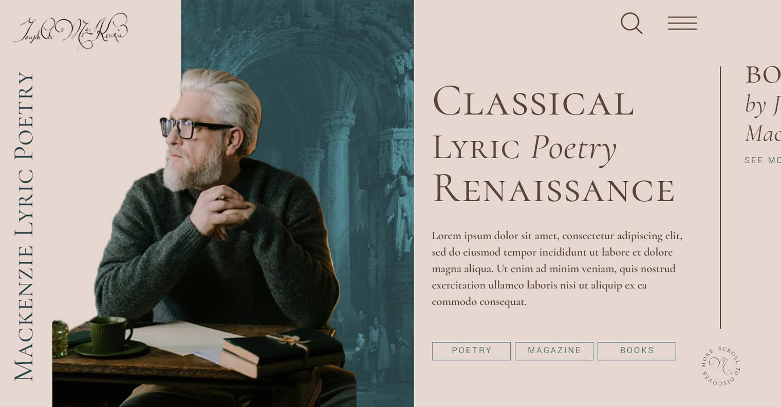
Personality and Ecommerce Website – Joseph Charles MacKenzie
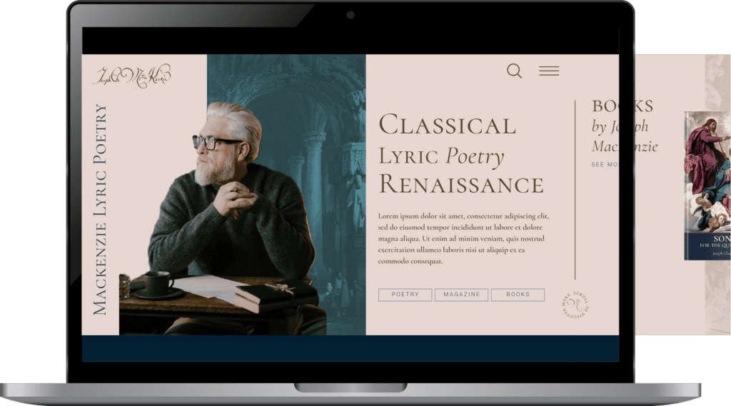
#1: What Was the Problem?
Joseph Charles MacKenzie, an award-winning Scottish lyric poet, had gained recognition in the UK during the 1980s and ’90s, but his visibility had since declined. His goal was to reintroduce himself to a younger, sophisticated audience interested in classical poetry, particularly those who appreciated traditional Western values and themes.
The challenge was creating a website that visually and functionally embodied his personal brand—blending modern artistic expression with traditional Western motifs—while also serving as an e-commerce platform to sell physical copies of his books. He wanted to avoid an antiquated look while still maintaining a strong connection to classical influences.
#2 How I Solved It
To strike the right balance between modernity and tradition, I implemented:
- Minimalist design with classical motifs – A clean, elegant layout complemented by detailed traditional Western artwork in the background, reinforcing his poetic themes.
- Horizontal scrolling homepage – A distinctive, unexpected navigation style that subtly conveyed a sense of artistic progression and set his site apart.
- Refined color palette – Off-white, off-black, and gold tones evoked sophistication while maintaining readability and aesthetic appeal.
E-Commerce integration – WooCommerce was implemented to facilitate book sales, including shipping and handling calculations, ensuring a seamless purchasing experience.
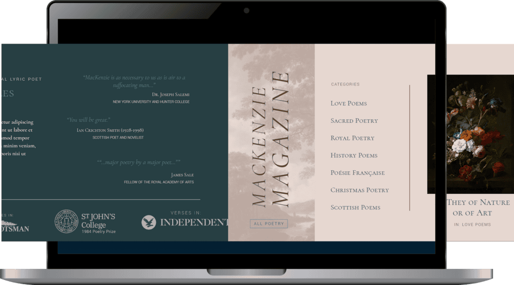
#3 Why This Approach?
Although Joseph’s art form is poetry rather than visual design, the use of traditional artwork and humanist typography helped communicate the values and aesthetics of his work. The horizontal scrolling homepage added a modern touch, reinforcing his identity as both a traditional and forward-thinking poet. The WooCommerce integration met his e-commerce needs while keeping users engaged on the site throughout the purchasing process.
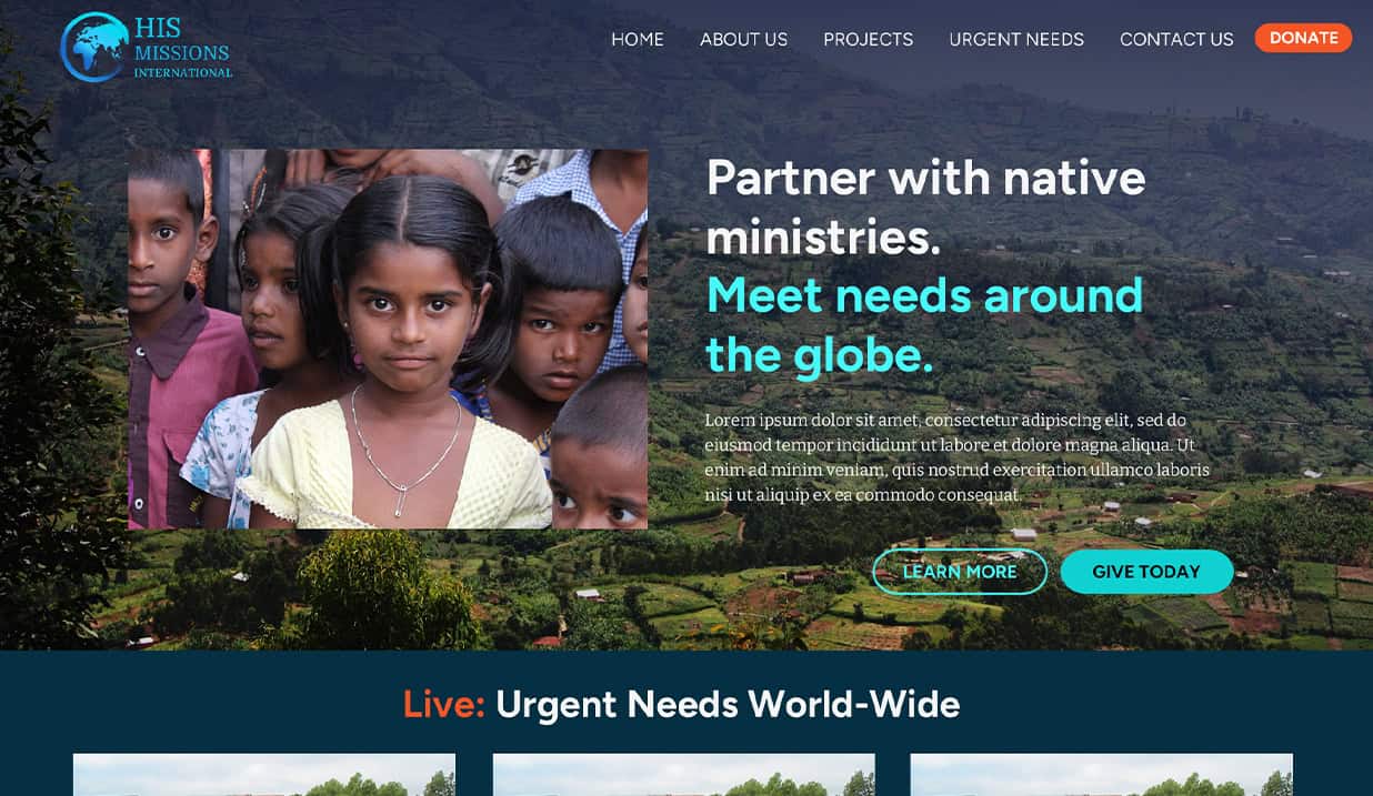
Non-Profit Fundraising Website – HisMissions

#1: What Was the Problem?
HisMissions International is a non-profit organization that provides aid, counseling, education, and essential resources to impoverished communities worldwide. Their unique model partners exclusively with vetted indigenous organizations, ensuring authenticity before connecting American donors to specific needs.
The goal of the website was to serve as a donation hub where U.S. donors could:
- See real-time needs as reported by indigenous organizations.
- Understand exactly where their donations would go and their potential impact.
- View past contributions and the global difference they had made.
The challenge was designing a platform that clearly communicated these needs while maintaining trust, transparency, and ease of use for donors.
#2 How I Solved It
To achieve this, I:
- Developed a cohesive brand identity – Designed a logo and color palette that aligned with the client’s vision of a technical yet internationally accessible aesthetic.
- Structured the website around six key service categories – Each category represented an area of impact managed by indigenous ministries.
- Created an “Urgent Needs” section – Highlighted time-sensitive fundraising efforts to encourage immediate action.
Designed a general donations feature – Allowed visitors to contribute even if they weren’t sure where to give, ensuring all donations could be utilized effectively.

#3 Why This Approach?
This structure provided clarity, ease of navigation, and a compelling user experience. By organizing the site around clear service categories and emphasizing urgency where needed, donors could quickly find causes they cared about and take action with confidence. The result was a visually cohesive, strategically structured platform that maximized donor engagement and impact.
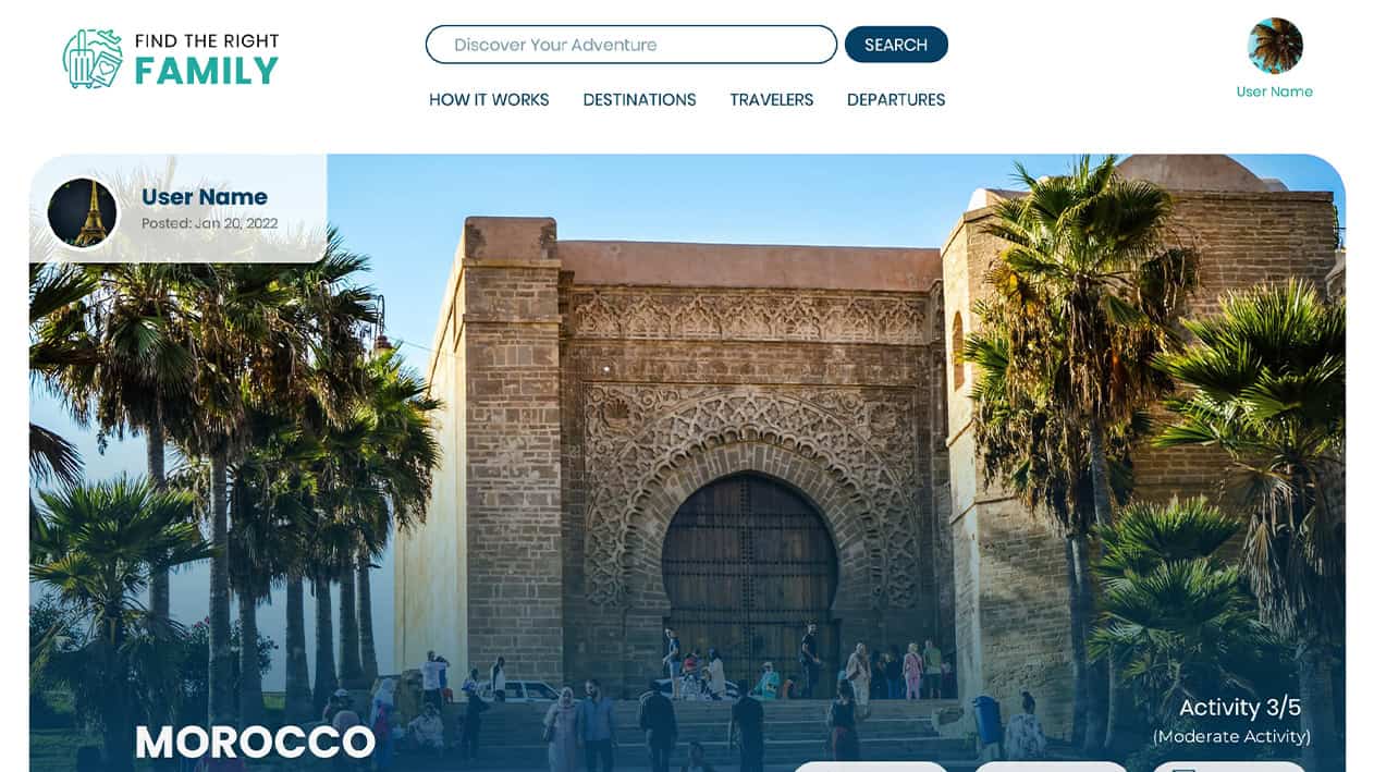
Travel Matchmaking Platform Website – Find the Right Family

#1: What Was the Problem?
Find the Right Family was designed as a unique platform that combined travel coordination with matchmaking for families. The concept came from a mother who frequently traveled and found trips most enjoyable when shared with other families.
The challenge was twofold:
Creating an intuitive user journey – Families needed a seamless way to find and connect with other like-minded travelers while navigating a new type of matchmaking process.
Clearly communicating the platform’s purpose – Since this was a one-of-a-kind service with only slight competition from other travel-matching sites, the website needed to immediately convey its mission without confusion.
#2 How I Solved It
To bring the client’s vision to life, I:
Built a secure chat system – This provided a safe space for families to connect and coordinate travel plans directly within the platform.
Conducted in-depth consultations – I worked closely with the client to refine the concept, review similar platforms, and establish the best approach for user experience.
Designed a structure similar to dating websites – We modeled the site after platforms like Match.com but added key features for travel coordination and family compatibility.
Implemented MemberPress for user profiles – This allowed paid members to create detailed profiles, including family size, preferred activities, avatars, bios, and travel history.
Developed a “Trips” feature – Users could create travel itineraries detailing destinations, dates, and planned activities, helping others determine compatibility.
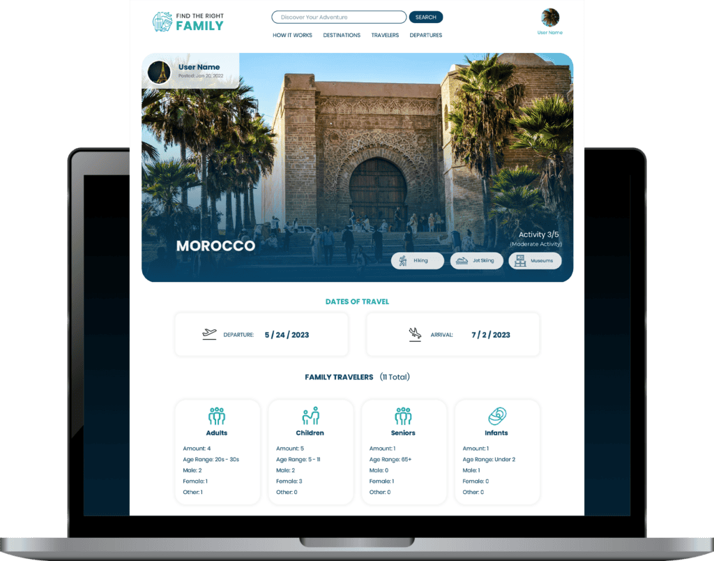
#3 Why This Approach?
By structuring the site like a matchmaking platform with added travel-specific features, I ensured that families could easily find compatible travel partners while maintaining a smooth, intuitive experience. The combination of detailed profiles, trip creation, and secure messaging made the platform both functional and user-friendly, setting it apart as a truly unique service.
Testimonials for Daniel
What My Clients Are Saying


SEO
Search Engine Optimization
Grow Website Traffic
This story could be yours. I transformed a humble mental health blog into an online authority. The site’s Google clicks exploded from a meager 10-15 monthly to a whopping 3.7K within 12 months.
Grow Ecommerce Revenue
A CPR training school I collaborate with for SEO provides in-person classes, tickets sold through WooCommerce on their website. Using a combination of technical, local, and on-page SEO tactics, their revenue has increased 24% since signing the SEO contract.
Let's talk about how I can serve your website.


-Title")


")


")


")
-draft-2")
Ready to work with me?
Let's Connect
Reach out using the form and let me know a little about yourself and the project you have in mind.
Because every project is different, I like to meet my clients face to face over a short video call. Let me know a time that works for you and I'll schedule the call. Excited to make your project dream a reality!
